
Introduction
In a groundbreaking collaboration, our boutique design agency recently partnered with a major US-based healthcare technology company. This project showcased our ability to deliver enterprise-level solutions, proving that size is no barrier to innovation and excellence. While we're bound by a non-disclosure agreement that prevents us from naming our client, the scope and impact of our work speak volumes about our capabilities.
The Client
Our client is a leading provider of healthcare professional (HCP) event management solutions in the United States. They serve pharmaceutical companies, medical device manufacturers, and other healthcare organizations by facilitating educational events, conferences, and workshops for healthcare professionals.
Their platform connects event organizers with venues, speakers, and attendees, streamlining the complex process of planning and executing medical education events. With a user base spanning thousands of healthcare organizations and hundreds of thousands of HCPs, our client plays a crucial role in the continuing education landscape of the medical field.
Lead Designer, Staff Designer
6 Months (Oct 23 - Mar 24)
2 UX Engineers, 20 Developers, 4 QA Engineers, 1 Project Manager
The Impact

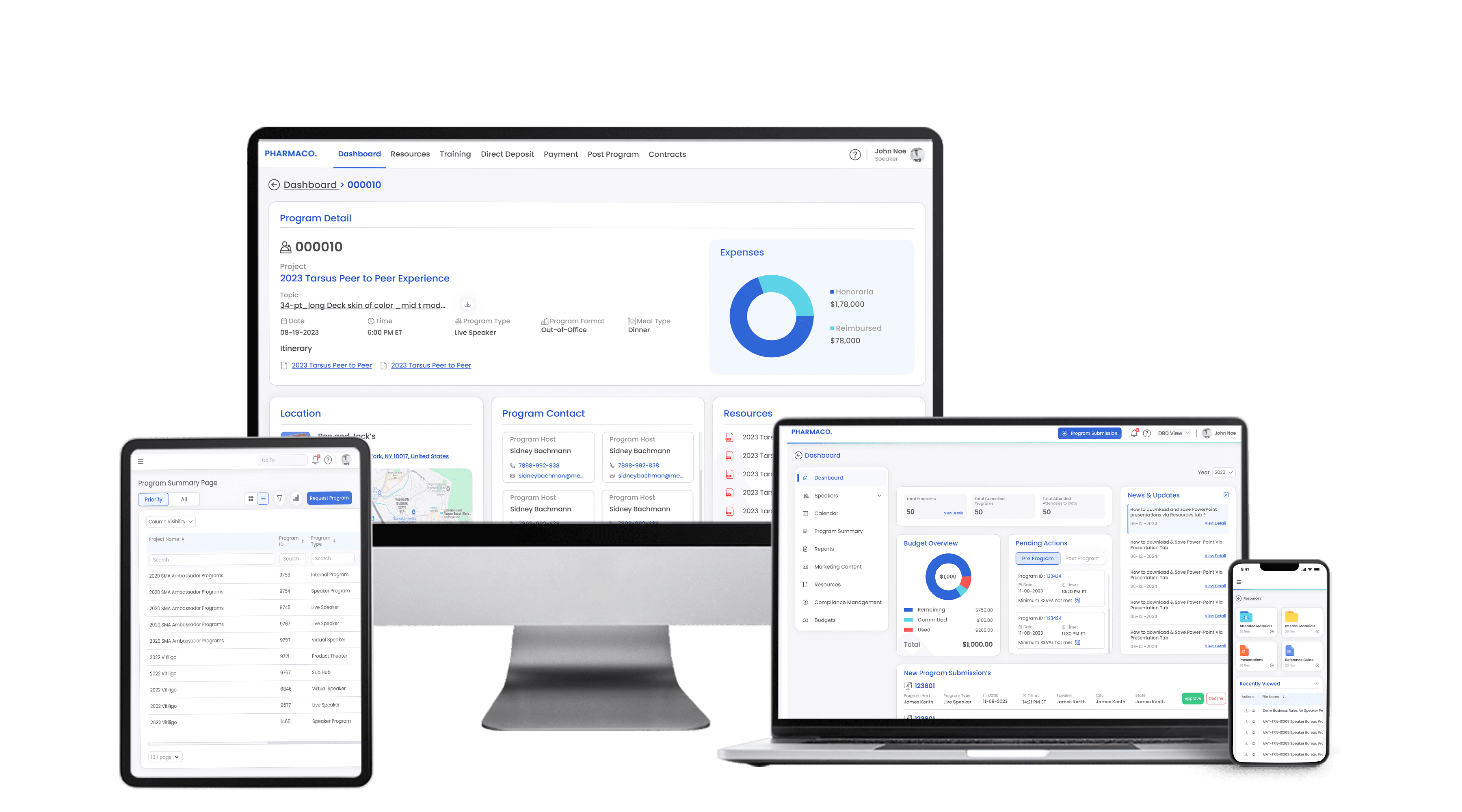
The Dashoard
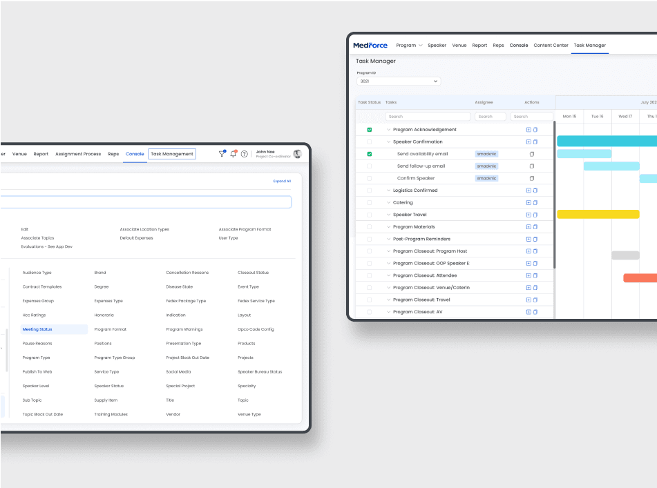
All the design were made responsive.
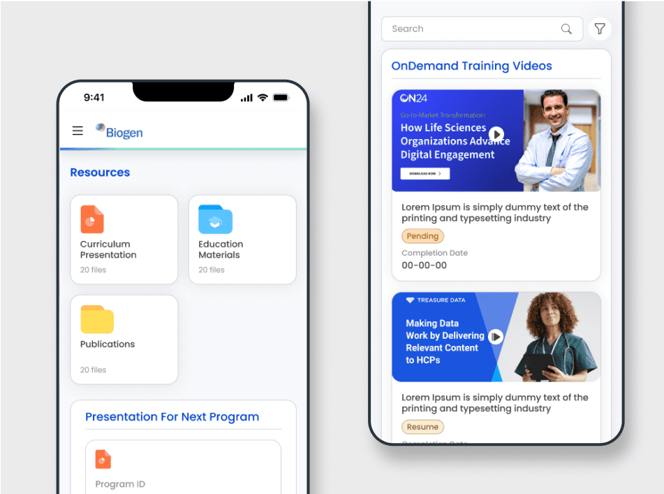
HCP Training Module. We put extra efforts on making sure design is mobile friendly.
The Problem
The client faced significant challenges with their legacy web application, including:
Outdated technology struggling to keep up with growing business needs
Poor user experience due to difficult navigation and lack of essential features
Inefficiencies and errors hindering operational efficiency
Limited scalability restricting their ability to grow and deliver high-quality events
The Outcome
While specific metrics are protected under our NDA, we can share the general impact our UX redesign had on key performance indicators:
User Engagement: Following the redesign, the average time spent on the platform increased significantly. Users were interacting with more features and spending longer periods navigating through the new modules. This increase in engagement suggests improved user satisfaction and a more intuitive interface.
Task Completion Rate: We observed a substantial improvement in task completion rates across various user roles. Event organizers, in particular, reported being able to set up and manage events more efficiently. The streamlined workflow reduced the number of steps required to complete core tasks by approximately 30%.
Customer Support Requests: After launching the redesigned platform, there was a noticeable decrease in support tickets related to usability issues. The number of "How do I..." queries dropped by an estimated 40%, indicating that users found the new interface more intuitive and self-explanatory.
To tackle the behemoth of 400+ screens, we embarked on an extensive information architecture (IA) analysis. This crucial phase allowed us to deconstruct the existing ecosystem and gain a holistic, bird's-eye view of the entire platform.
Our IA strategy involved:
Comprehensive content inventory and audit
User flow mapping and task analysis
Card sorting and tree testing for intuitive navigation
Creation of detailed sitemaps and wireflows
Semantic analysis for consistent taxonomy and nomenclature
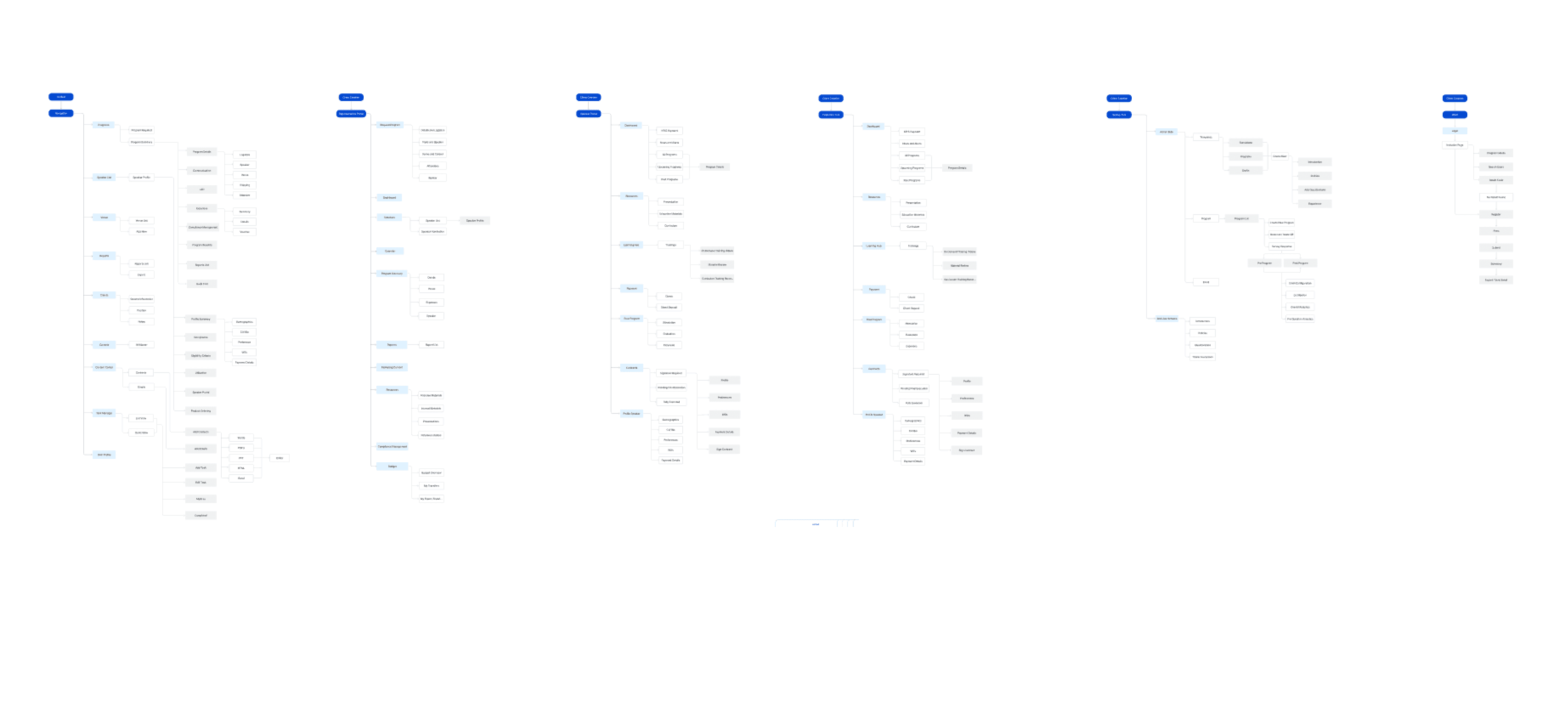
This process revealed critical pain points and opportunities for optimization, setting the stage for a user-centric information hierarchy.
Our meticulous IA work laid the foundation for a scalable, future-proof design system. This process revealed critical pain points and opportunities for optimization, setting the stage for a user-centric information hierarchy. By employing atomic design principles and establishing a robust component library, we ensured consistency across the platform while dramatically improving findability and discoverability.
This satellite view of the system not only informed our UX strategies but also facilitated seamless collaboration with stakeholders, aligning the product vision with user needs and business goals.
Despite limited user access, we conducted an intensive research phase to gain deep insights into the HCP event management ecosystem. Our innovative approach combined stakeholder knowledge with industry best practices:
Stakeholder Interviews: Conducted in-depth sessions with three key client stakeholders, employing the "Jobs to be Done" framework to uncover latent user needs.
Proxy Persona Development: Created data-informed personas based on stakeholder insights, utilizing the "Assumptive Persona" technique from Lean UX methodology.
Heuristic Analysis: Performed a comprehensive evaluation using Nielsen's usability heuristics and Shneiderman's "Eight Golden Rules of Interface Design."
Competitive Benchmarking: Analyzed 5 competitor platforms to identify industry patterns and differentiation opportunities.
User Journey Mapping: Developed detailed journey maps for each persona, highlighting pain points and moments of delight.
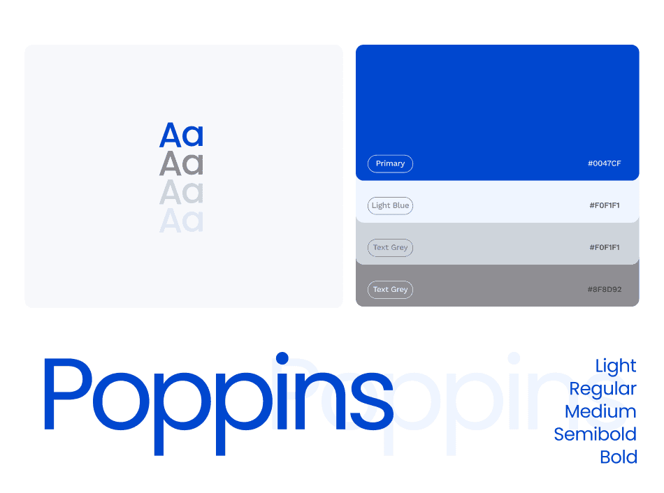
The Styleguide
HCP Training Module. We put extra efforts on making sure design is mobile friendly.
All the design were made responsive.