
How I Solved a Critical Content Management Problem for Creators and Managers
Combining 5 legacy platforms into 2 Portals
Background and Context
In today’s digital landscape, content creators and managers face a persistent challenge: effectively managing and optimizing content across multiple platforms. Traditional tools often fall short, focusing mainly on scheduling and basic analytics, while neglecting the intricate processes that drive content virality and engagement.
Recognizing this gap, a forward-thinking startup approached us with a unique vision—to develop a platform that not only simplifies content management but also enhances collaboration between creators and managers. This platform would allow users to seamlessly collect, evaluate, and optimize content, enabling them to stay ahead of trends and drive higher engagement.
Role
Lead Designer, Staff Designer
Duration
6 Months (Oct 23 - Mar 24)
Team
2 UX Engineers, 20 Developers, 4 QA Engineers, 1 Project Manager
My Role & Contribution
As a sole product designer, I collaborated closely with two industry experts: a CTO from Silicon Valley and a social media manager known for his viral content strategies. Together, we identified the core pain points and designed this product to bridge the gap between content creation and management. My responsibilities included:
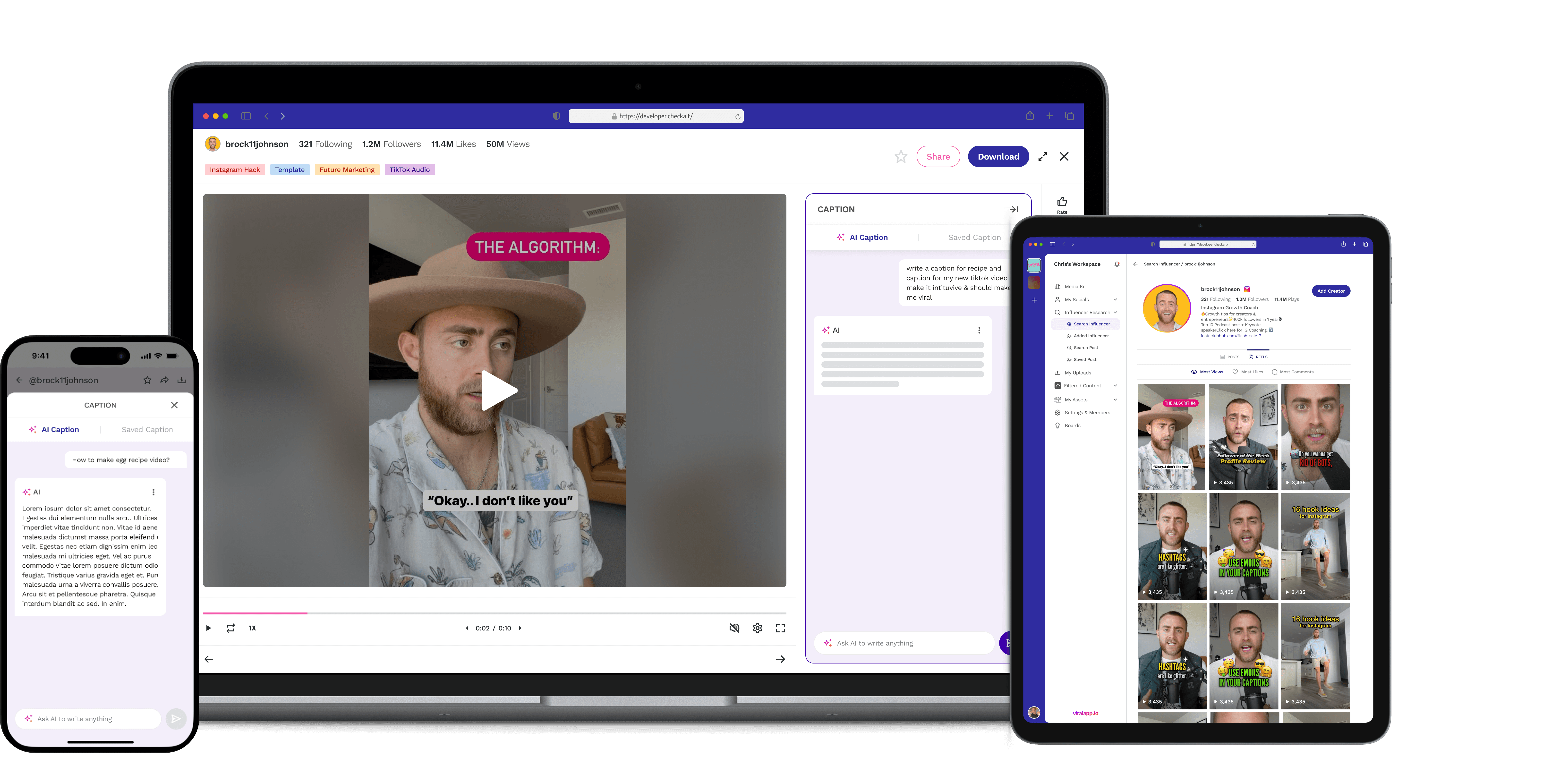
Designing the Core Experience: I crafted an intuitive workspace that allows users to link their Instagram and TikTok accounts, easily search for and scrape content, and add custom tags, ratings, and AI-generated captions and scripts. This workspace was designed to replicate the familiar user interface of popular social media platforms, making it easy for users to navigate.
Developing Advanced Features: We introduced innovative features like AI-powered tools for generating subtitles, captions, and scripts, as well as a robust tagging and rating system. These tools were designed to enhance the content evaluation process, enabling users to quickly identify and repurpose high-performing content.
Adapting to Technological Constraints: During development, we encountered limitations with Instagram's API, which impacted our initial design direction. We adapted by implementing a notification system that alerted users when posts were ready to be published, ensuring that all content was accurately scheduled with complete captions.
The Impact
70
%
Users reported a significant boost in productivity, attributing it to the app's advanced content management and collaboration tools.
90
%
Users felt more creative and efficient in content creation, thanks to AI-generated captions and script features.
85
%
Surveys indicated an 85% user satisfaction rate, with users praising the intuitive interface
90
%
The platform achieved a 90% task completion rate in key user tasks such as content tagging and scheduling,
The landing Dashboard before and after
A Niche Aesthetic — Embracing the Vaporwave Trend
During the initial discussions, the client specifically inquired about our familiarity with the Vaporwave—a niche aesthetic trend that was gaining popularity. At the time, vaporwave was relatively unknown within our office, including among senior leadership.
This posed a unique challenge: to secure the full web app design project, we needed to demonstrate not only our design expertise but also our ability to quickly adapt to and excel in an unfamiliar trend.
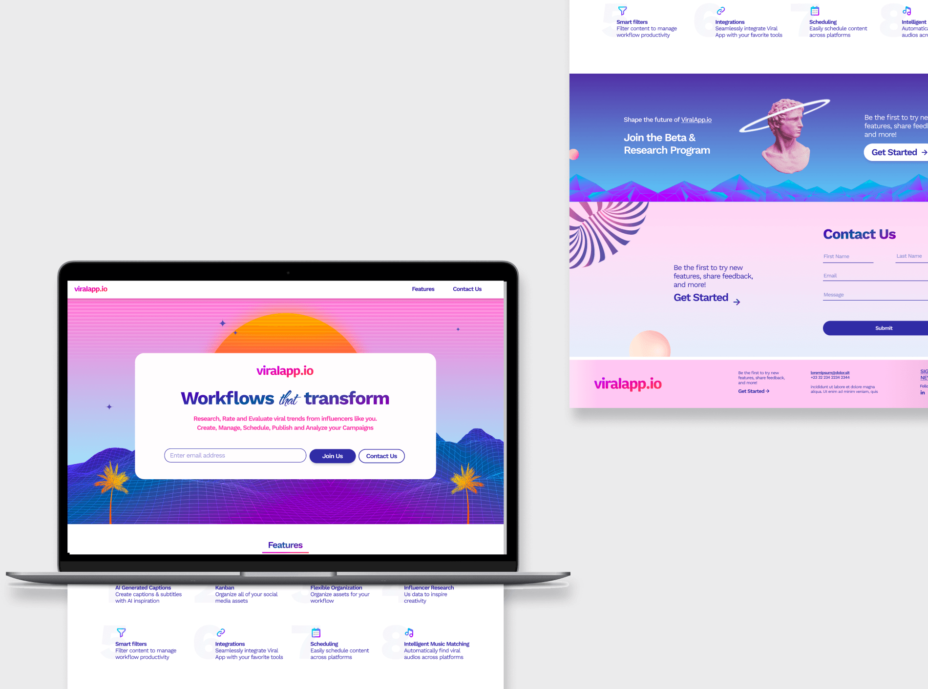
Website had big influence of Vaporwave Design
Recognizing the importance of this design direction, I undertook a deep dive into the vaporwave aesthetic,—neon colors, retro-futuristic imagery, and glitch effects—to ensure that our design would resonate with the client’s vision. We approached this challenge integrating the vaporwave elements in a way that was both true to the trend and aligned with the brand's identity.
The result was a visually striking website that not only captured the essence of vaporwave but also impressed the client with its originality and attention to detail.
This successful execution played a pivotal role in securing the entire web app design project. It also demonstrated my ability to rapidly assimilate new design trends and apply them in a manner that meets high client expectations.
The Problem
The client faced significant challenges with their legacy web application, including:
Outdated technology struggling to keep up with growing business needs
Poor user experience due to difficult navigation and lack of essential features
Limited scalability restricting their ability to grow and deliver high-quality events
The Impact
While specific metrics are protected under our NDA, we can share the general impact our UX redesign had on key performance indicators:
User Engagement: Following the redesign, the average time spent on the platform increased significantly. Users were interacting with more features and spending longer periods navigating through the new modules. This increase in engagement suggests improved user satisfaction and a more intuitive interface.
Task Completion Rate: We observed a substantial improvement in task completion rates across various user roles. Event organizers, in particular, reported being able to set up and manage events more efficiently. The streamlined workflow reduced the number of steps required to complete core tasks by approximately 30%.
Customer Support Requests: After launching the redesigned platform, there was a noticeable decrease in support tickets related to usability issues. The number of "How do I..." queries dropped by an estimated 40%, indicating that users found the new interface more intuitive and self-explanatory.
Consumer app
User Research: Unveiling Insights in Constrained Environments
Despite limited user access, we conducted an intensive research phase to gain deep insights into the HCP event management ecosystem. Our innovative approach combined stakeholder knowledge with industry best practices:
Stakeholder Interviews: Conducted in-depth sessions with three key client stakeholders, employing the "Jobs to be Done" framework to uncover latent user needs.
Proxy Persona Development: Created data-informed personas based on stakeholder insights, utilizing the "Assumptive Persona" technique from Lean UX methodology.
Heuristic Analysis: Performed a comprehensive evaluation using Nielsen's usability heuristics and Shneiderman's "Eight Golden Rules of Interface Design."
Competitive Benchmarking: Analyzed 5 competitor platforms to identify industry patterns and differentiation opportunities.
User Journey Mapping: Developed detailed journey maps for each persona, highlighting pain points and moments of delight.
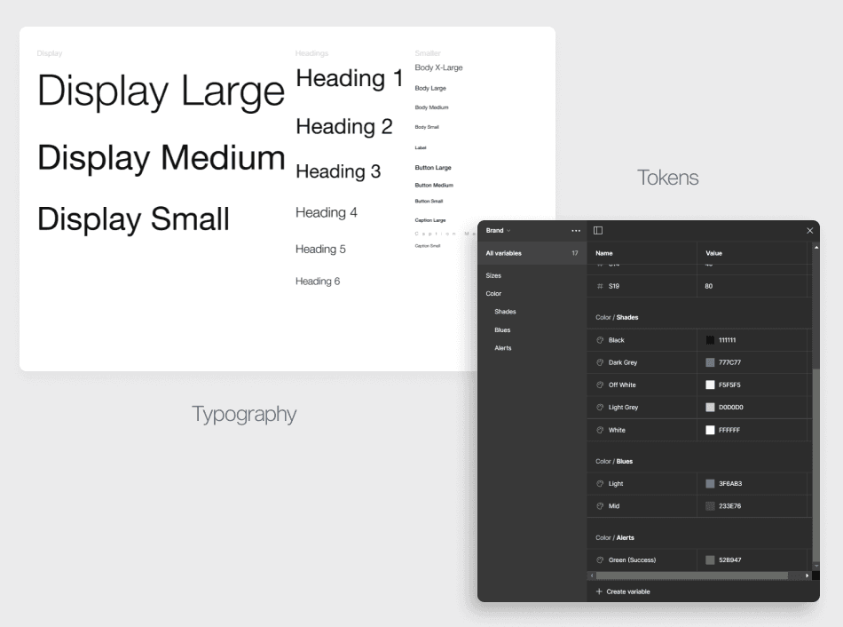
The Styleguide
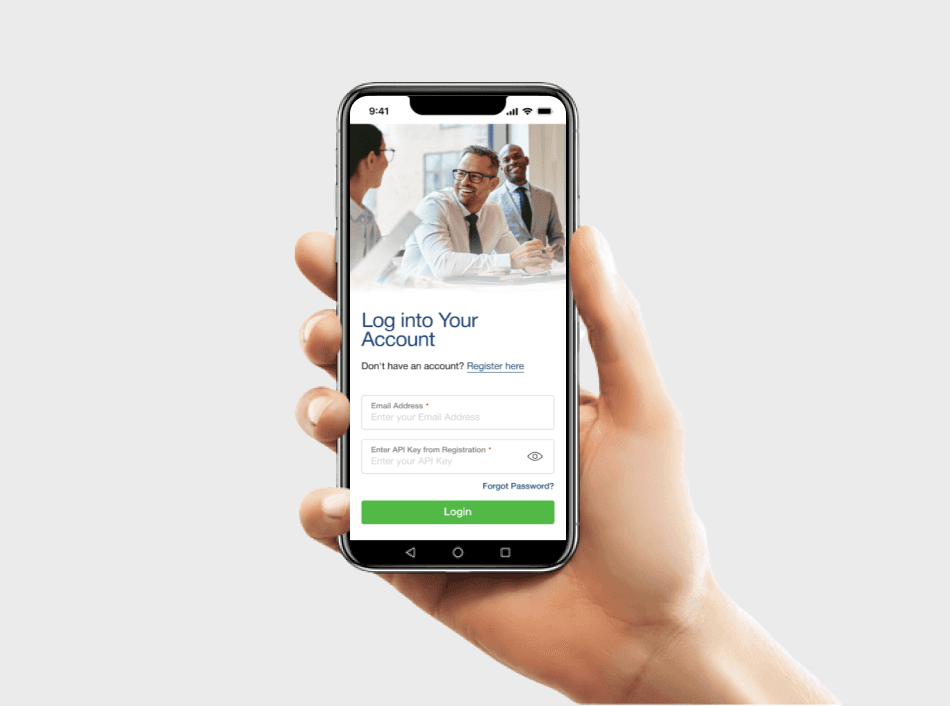
Redefining Developer Onboarding: Beyond the Portal
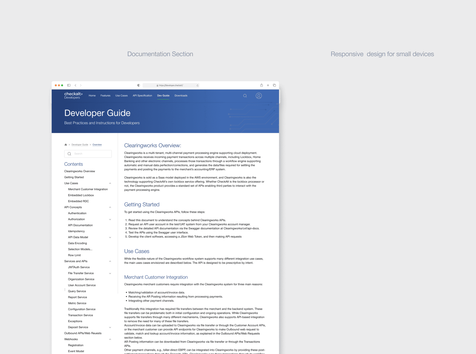
The developer portal was crucial for our client to extend their APIs to financial institutions, enabling seamless integration of check processing services. the portal became a cornerstone of our client's API-first strategy, driving adoption and fostering partnerships with major financial institutions.
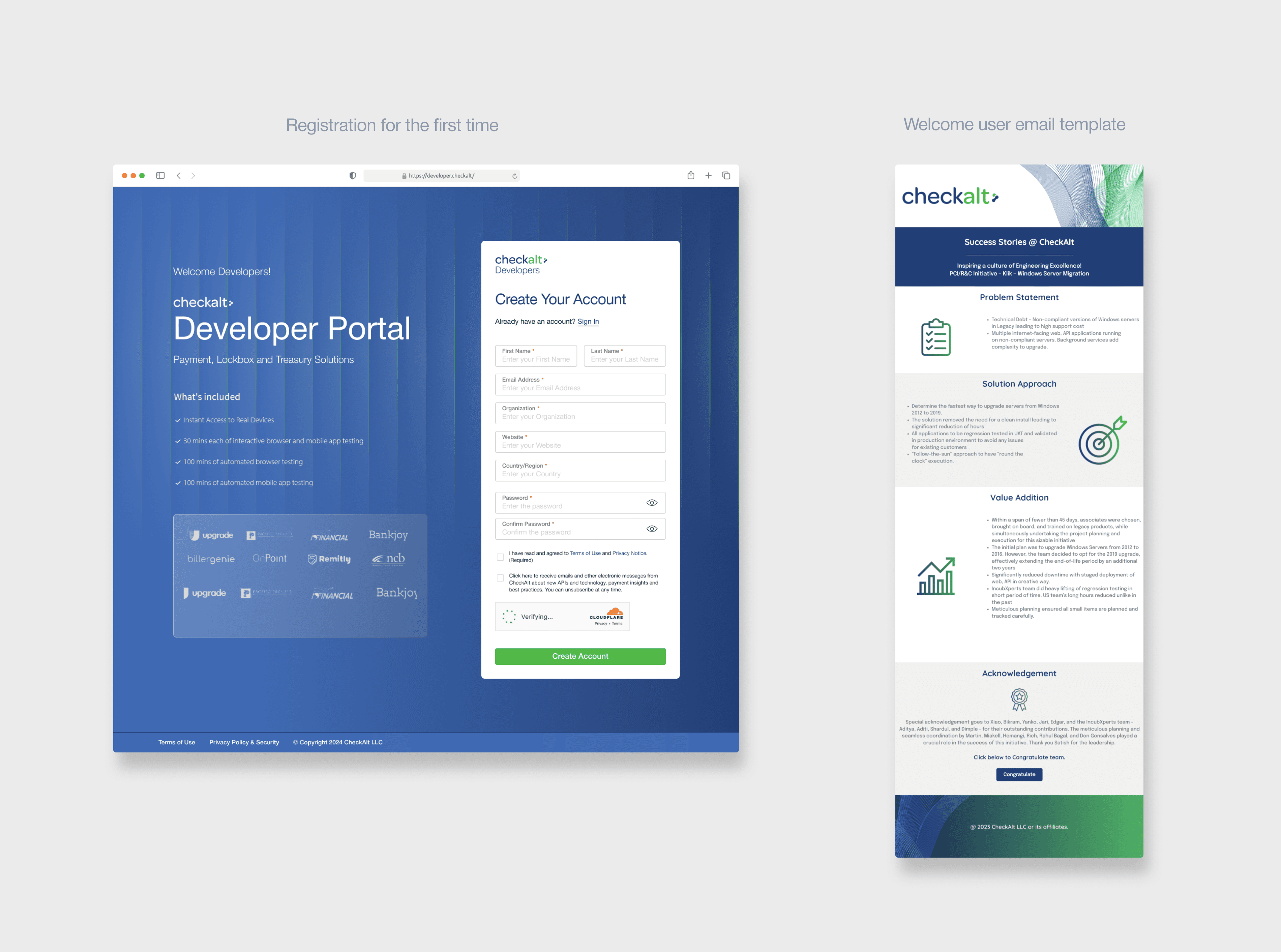
I extended the user experience to the often-overlooked yet critical touchpoint of the welcome email.
While designing the Developer Portal, I recognized that a smooth onboarding process is crucial for developer engagement and adoption. My approach went beyond creating an intuitive registration form; I extended the user experience to the often-overlooked yet critical touchpoint of the welcome email. By designing both the account creation interface and the initial email template, I ensured a cohesive and welcoming experience from the moment a developer discovers our portal to their first interaction post-registration.
I extended the user experience to the often-overlooked yet critical touchpoint of the welcome email.
The implementation team reported a 40% decrease in support tickets due to the portal's comprehensive documentation and intuitive navigation.
Marketing team leveraged the portal's user-friendly design in campaigns, highlighting our client's commitment to innovation and ease of use.
From custom Solution to White Label Product
After successful implementation for [Client Name], the payment process web app was adapted as a white label solution.
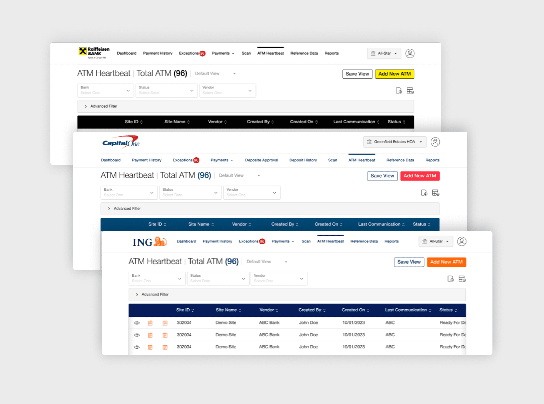
The robust and flexible nature of the design allowed it to be repurposed as a white label product
This allowed other businesses to use the core functionality while customizing the branding to match their own visual identity. For instance, [Fictional Company X] integrated our white label solution, adjusting the color scheme from the original blue and white to their brand colors of green and gold, and replacing our logo with their own.
The robust and flexible nature of the design allowed it to be repurposed as a white label product, expanding its market potential and demonstrating its adaptability to various business needs.
Within 18 months of launching the white label version:
23+ businesses adopted the solution
Processing volume increased from $5 million/month to $50 million/month
User satisfaction scores averaged 4.8/5 across all implementations
Integration time decreased from an average of 3 weeks for custom solutions to 3 days for the white label version"